How I Built This Portfolio
A breakdown of the architecture, design decisions, and technologies behind this site — from the Next.js App Router setup to the animated shader background.
Sample post. This article documents the real stack this site is built with, written up as a case study to show what a project write-up looks like on this blog. Replace it with your own words whenever you're ready — the structure underneath is reusable for any project post.
01Overview
This portfolio is built with the Next.js App Router, TypeScript, and Tailwind CSS v4, with Framer Motion (the motion package) handling scroll and hover animations and Three.js powering the animated background shader on the homepage.
02Problem
A portfolio needs to do two things that usually pull in opposite directions: look distinctive enough to be memorable, and load fast enough that nobody bounces before it finishes rendering. Most template-based sites solve this by picking one side.
03Goals
- A homepage that feels personal rather than templated
- Section navigation that works both as in-page anchors and, now, as real routes for standalone pages like this blog
- A component library I could extend without fighting the framework
- Dark and light themes that actually match, not just invert
04Technologies
| Layer | Choice |
|---|---|
| Framework | Next.js 16 (App Router) |
| Language | TypeScript |
| Styling | Tailwind CSS v4 |
| Animation | Framer Motion |
| 3D / Shader background | Three.js via @react-three/fiber |
| Components | Radix UI primitives, styled in the shadcn pattern |
05Architecture
The site is a single Next.js app. The homepage (/) is one long scrolling page built from independent section components — hero, about, skills, projects, contact — each one a self-contained component that reads shared design tokens (colors, radii, spacing) from CSS variables defined once in globals.css. That's what keeps dark mode consistent: components never hardcode a color, they reference bg-background, text-muted-foreground, and so on, and the variables swap underneath them.
Routed pages, like this blog, sit alongside the homepage as their own directories under app/, sharing the same navbar, footer, and theme provider so they feel like the same site rather than a bolt-on.
06Development
Most of the interesting work happened in the small components: a reveal-on-scroll text component, a project grid with a glowing hover effect, a skills panel with orbiting icons. Building the blog followed the same philosophy — reuse the existing navbar, footer, buttons, and color tokens, and add only what was actually new: content storage, article rendering, and a couple of blog-specific components.
07Challenges
Keeping the homepage's dark theme consistent across every new section was the recurring challenge — it's easy to accidentally hardcode a color that looks fine in dark mode and breaks in light mode. The fix was discipline: every new component uses the same semantic color tokens (bg-card, text-foreground, border-border) instead of literal hex values.
08Solutions
Centralizing the design tokens in globals.css meant that as long as new components used them, theme consistency came for free. The same approach carried straight into the blog: the code blocks, category pills, and article typography all pull from the same palette as the rest of the site.
09Results
A single codebase that supports both a scroll-driven homepage and standalone routed pages like /blog, without needing a second design system or a duplicated navbar.
10Lessons Learned
Reusing existing primitives is almost always faster and more consistent than reaching for a new library — the blog you're reading right now uses the same Button component, the same border radius scale, and the same fonts as the rest of the site.
11GitHub
Explore the rest of my projects on GitHub.
Related Articles
 Projects
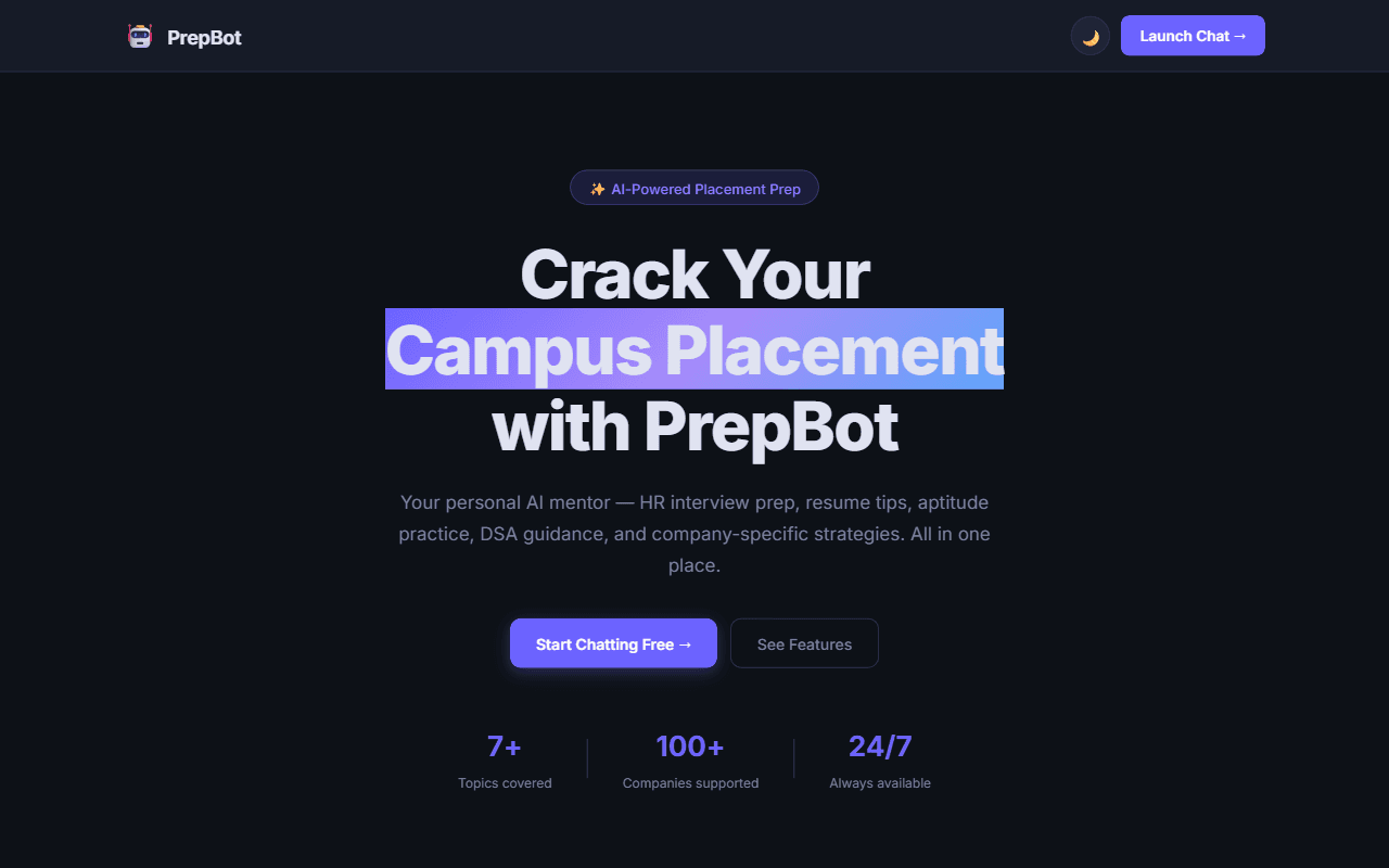
How I Built PrepBot — My Flinders AI Hackathon Journey
An AI-powered placement prep chatbot built with plain HTML, CSS, and JavaScript — and the story of how it won 1st place at the Flinders University AI Hackathon.
Sep 5, 2026 · 5 min readRead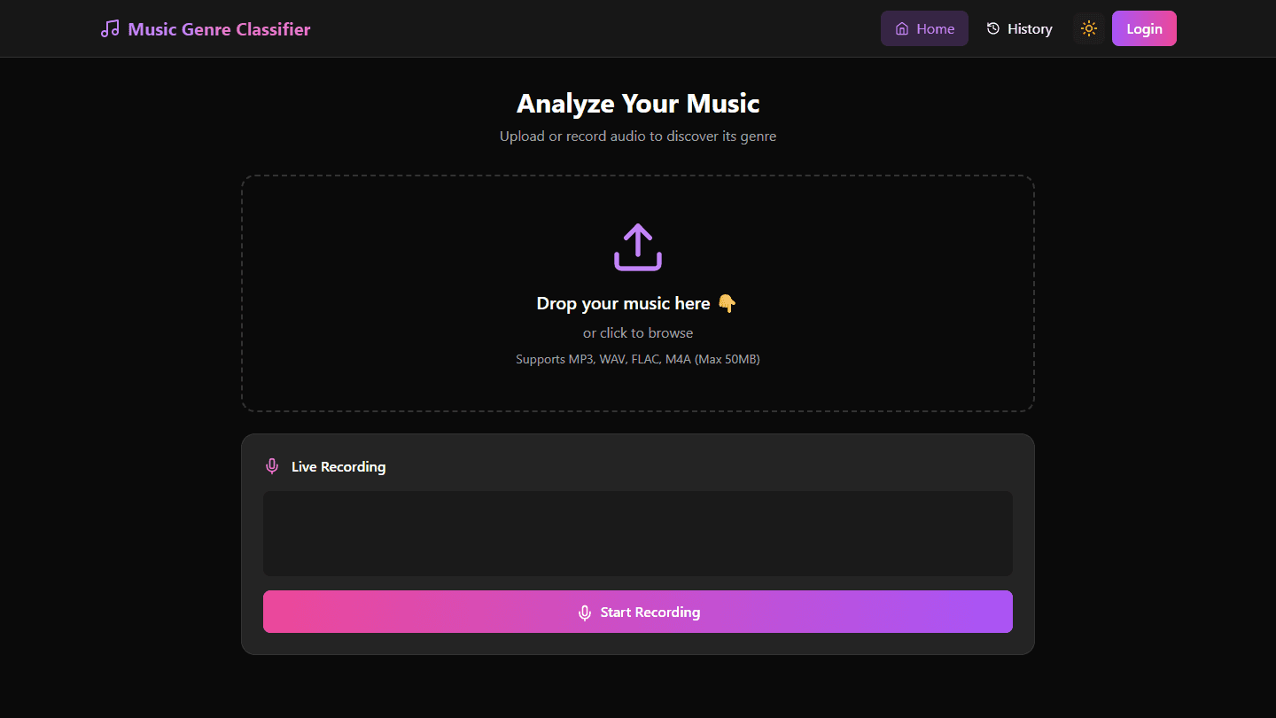 Projects
SongSense: A Music Genre Classifier from Audio Signals
How SongSense uses audio signal processing and spectral analysis to classify music genre, and where it landed on accuracy.
Aug 15, 2026 · 2 min readRead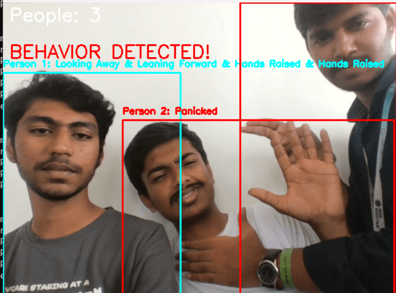 Projects
Safe Vision: Real-Time Assault Detection with Blockchain Evidence
How Safe Vision combines a real-time computer vision model with blockchain-backed evidence storage to flag suspicious activity from live video.
Aug 10, 2026 · 3 min readRead